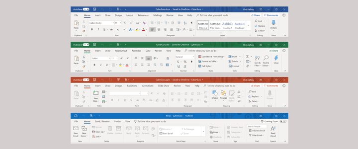
After twenty years of faithful service the familiar Microsoft Office ribbon, containing your menus and commands, is going to change. As part of the latest round of updates, a new look is being rolled out progressively across the Office programs, beginning with Outlook. But don’t worry, you will have two choices of ribbon – the simplified ribbon or the classic ribbon.
If you have been using Office for a while, you will begin to notice some changes to the look and feel of the various products. Starting with Outlook, Microsoft is revising how the user interface appears. The simplified ribbon aims to help users “focus on their work and collaborate naturally with others”. The simplified ribbon will streamline the existing top section of the screen, reducing the space it takes up on the screen.
Here’s an example of how it looks in Outlook:

You can switch between the simplified ribbon and the classic ribbon by using the switch icon, which is located near the top right of the window.
These changes will also follow on Word, Excel and PowerPoint. In addition, the ribbon has a new appearance with new colours and icons and has been designed to scale on screens of any size.
For more information on the simplified ribbon, please see the Use the Simplified Ribbon support page (link opens in new window) and reference guide (link opens in new window).
CyberGuru provides consulting, training and support in Office 365, including Outlook, Word, Excel, PowerPoint as well as a range of other products. If you would like to know more or want to enhance your knowledge and skills, please contact us.


